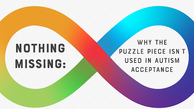
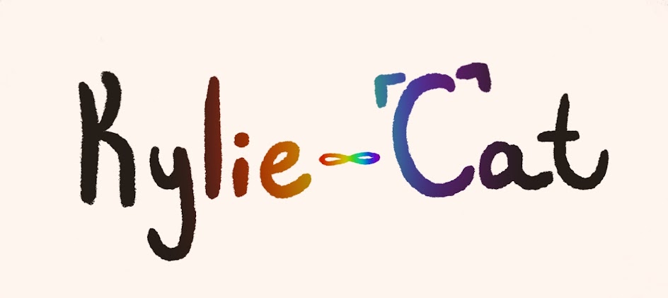
To start off, I thought of some traits I’d like to try to include in my title graphic. First of all, I couldn’t resist the idea of making the word ‘Cat’ resemble one in someway, both for cute points and for better distinguishing letters, like how Moana’s O is stylized. The current symbol for autism is a rainbow infinity symbol, so I was also wondering if there was a way I could incorporate that into my graphic too. You may be wondering what happened to the puzzle piece symbol, but a lot of autistic people actually don’t use it anymore, since some said it implied that they are somehow ‘incomplete.’ Though, some people still prefer it.
After I had these two ideas in my head, I went to my drawing app (Procreate) to pick a brush. I wanted a brush with a bit of texture. A really smooth/clean brush just really didn’t seem to fit in my mind. Kylie isn’t perfect, so neither should her font be. I didn’t want a super textured one though, as I felt it would be pretty distracting. I ended up going with one called ‘mercury’ that I had made my own edits on. At a distance, the brush makes the font look smooth enough, but a closer look makes it clear how jagged the edged are, symbolizing how Kylie tries to mask and seem normal to those around her, but in the end, she’s just damaging her mental health since she can never actually be neurotypical.
I then wrote out the title itself before getting to work decorating it. I started out with ‘cat’ since that felt easier and more straightforward. I gave the ‘C’ two little triangles at the top to resemble cat ears, and made the end of the ’t’ curl up to act like a tail. To include the infinity sign, I made it replace the dash in Kylie-Cat. I debated whether or not to include the rainbow, but it was looking too plain without it. Plus, it would make it clearer what it was actually supposed to represent. Playing with the rainbow idea further, I made the gradient fade onto the letters as well, almost creating a glowing effect from the infinity sign.
I made two versions of the title, one in a lighter color and one in a darker one in order to accommodate for whatever color background it needs to be put on. With that, my title is done!


Comments
Post a Comment